Tuesday, November 20, 2018

Sweater Weather

Things go in cycles, but one constant is that I don't update my blog regularly enough. It's Thanksgiving week, which usually means a few days off. Really off. Not running the farmers' market, not getting kids off to/from college. And, the weather has turned. The freezing fog and threats of snow lead me to dust off my knitting basket and see what I've left abandoned during the hot weather.
Sunset over Circus Circus
The longest running WIP is my Noro modular sweater. It's probably been taking so long since I've been making up the pattern as I go. I'll get a section done then need to cogitate how the next bit fits on. I've finished the fronts and am starting saddle shoulders to connect the fronts and back. This should set me up for the arms, the collar, and the peplum. I'm not sure how I want any of that to look. The sweater is so riotously colorful.
The second longest running WIP is this yoked cardigan. After suffering endless boring brown and the actual loss of one sleeve on a car trip, I completed the yoke this summer. It really doesn't need too much more before it's done. Yesterday I slit the front and wove the ends, so it's button bands and a collar then into the wardrobe. I hate finishing work, but I want to wear it.

This third sweater in progress is a new animal for me. Nearly all of my sweaters to date have been warm woolly things that are predominantly worn for warmth. I've never had an "office weight" sweater, although my office is frigid enough that I wear warm sweaters frequently and take them on and off as the temp varies. This sweater will be short sleeved! Primarily because that is all the yarn amount I have. It's been a beast to knit the gauge properly. I've had to rip the body section twice. My fingers do not like knitting fingering weight yarn at the specified dk gauge, but that is what the pattern states. I have been able to work on this during the summer due to its light weight and size. It fills the slot for the mindless knitting project. I have round and round and round of straight purple to go, sort of the opposite of the Noro Modular.

Sunday, August 27, 2017

Thinking Big

Well, I've kept my resolution to make more art this year. I just haven't blogged much about it.  Here is my latest big effort, and big it is. This is important, as I have a gallery show early next year and flat out need plenty of pieces to select from and some size variety will be good.

New mandala on full watercolor sheet (22 x 30")
I'm trying a new technique to get the ink on the page: drawing small then enlarging it using a projector.  Reasons why this might be good...

  1. No construction lines to erase.
  2. No construction lines leaving dents in the paper in open spaces.
  3. Don't have to struggle with a pencil compass to draw a 20" circle.
  4. Easier to draw smooth curves on a small scale.
  5. Ability to start over on a new sheet without starting completely over if I f*** it up, which I did sadly in this case but didn't lose the many hours doing the initial steps.
  6. I can theoretically do something in acrylic or oil without having to puncture the canvas with the compass point.
Some people in the art community think that projector are evil, but frankly if it is just me enlarging my own drawing I say to heck with them. I got the Artograph Flare 100, which was pricey, but has the ability to take multiple inputs (smartphone, thumb drive, USB, HDMI.) We can even watch a movie by projecting a DVD onto a blank wall, if there was  such a thing as a blank wall in this house.

This shows how big compared to other recent works.
 It's going to take about 8 times longer to paint the watercolors than a small one, so I'd better stop typing and get painting.

Sunday, January 1, 2017

Happy New Year

New Year's Greetings. I hereby make my annual declaration that I have resolved to make more art and creative things in general. This includes paintings, drawings, stitching, knitting, writing, cooking, and such. May the new year bring great things for you and yours.
Starting with the finish, for those of you with short attention spans.

Trying a new ink - Noodler's X-Feather.
It behaved so well - so dark and rich, and as advertised it did not feather one little bit.
Unfortunately, my opinion changed when I hit it with water. Not as waterproof as advertised.
I'm looking forward to using it for black and white drawings though

Making the best of it by painting carefully.


Sunday, July 24, 2016

Blue Star: Start to Finish

Here are some in-process photos of a painting I recently finished.


Some guidelines drawn with light blue colored pencil.
They don't call it non-photo blue without a reason.

Some of the lines now inked with a nice waterproof fountain pen ink -
Noodler's Bad Belted Kingfisher cut with some of their
Whiteness of the Whale ink to lighten the shade considerably.

Adding some watercolors.


A few more sessions and all the blocks are now filled in.

Completed painting. Ta da.

Sunday, June 12, 2016

FW FTW?

Trying out some new ink today. I've been playing around with different inked line colors in my watercolor mandalas and wanted to try some lighter shades, so the outlines give a different effect because they don't contrast so much.
The green inset at the top left uses light green ink lines;
the top inset at the right uses pale grey lines;
the bottom picture uses grey straight from the bottle.
The samples above were all using Koh-i-noor Trans-Mix inks, which come in about 20 colors. I really love the way they work in technical pens, and had collected all the colors over the years, although the white had sat unused until recently. I'm not sure if the ink being a decade old or more was the problem, or if white is just problematic, but the white ink was thick like cream rather than the nice inky consistency of all the other colors. Brighter and darker colors can get away with a thin medium and their staining effects, but white needs big pigment particles to stay on the paper surface and make it opaque. Thick ink quickly clogs technical pens, which rely on a very skinny metal tube with a wire running inside that to convey the ink from the barrel to the tip.


Online reviews spoke favorably of Daler-Rowney's FW Acrylic white ink, although most people were using brushes or dip pens for their work. FW inks seemed a lot easier to find online than Trans-Mix, offer a number of colors, and claimed to be safe for technical pens. So, click-click-click and two days later Amazon had sent me a bottle for about $16. I optimistically opted for the big bottle, but it comes in a one ounce size too for about half that price.

I was really glad to have a syringe on hand for filling fountain pen cartridges and converters, because there would be no other graceful way to transfer my mL into the ink reservoir. Koh-i-noor makes an entry level technical pen set that I chose to use so I could see what was going on inside and to minimize losses if something bad were to happen. I picked the boldest size, with the biggest steel tube.

I filled the reservoir with white and added the smallest drop possible of a Trans-mix color, one experiment each with Vermilion and Sepia inks. Trans-Mix + FW seemed to go well into the pen. The FW white was a lot thinner than the Trans-Mix white, so one problem has been solved. I used a toothpick to thoroughly mix the ink, then tested the outcome on white and black papers.

Both were suitably pale, but not as opaque as I'd hoped. When used on top of pencil lines, it seems to seal the pencil lines in and let them show through, rather than cover them up. I was pleased where the pen strokes overlapped that the area didn't show as being doubly dark. The mix was fully waterproof, which is an important essential quality, and was expected since both components are waterproof. With the Sepia mix, I initially had some issues keeping the pen primed. It required a fair amount of fussing to make the lines solid. The Vermilion was better, and since the Trans-Mix part was so minimal, I'm writing it off to the pen itself and not the ink. It was also the same pen I used the Trans-Mix white, so it may have left some internal clogging. Time for the ultra-sonic bath!


Most of the color tinting is lost on black.
You never know what you get when you mix two different brands of inks, even though one was in the merest quantity today. Leaving the pen sitting capped for about 30 minutes, things became a bit unmixed. Nothing that couldn't be gently agitated back into submission, and nothing that became evil (gummy and globby.) 


The final test will be drawing something and painting it. I need to buy a few colors of FW inks for mixing to follow up this review, so stay tuned for a part 2.

Monday, May 9, 2016

Avoid being a crumby artist

Practicing your art is key to becoming a better artist, but this simple tip will instantly keep you from being a "crumby" artist. This will not be a newsflash to anyone who did any drafting in the Pleistocene pre-AutoCAD era, but it may be news to some of you just picking up that nice new set of colored pencils to work in your new adult coloring book.

This is the way the cookie crumbles.
Your color blending technique may be spot on. Maybe you use a burnisher or a colorless blender pencil to smooth out the area so no white spots show through. But, invariably, these little crumbs of color appear. Some combinations of pencil brand and paper brand will make it worse, some less so.

STOP. Do NOT blow them off.

Your breath has tiny moisture particles (remember, if you are reading this, you can "fog a mirror".) This can be disastrous, especially if you are using water soluble color pencils (unless you are going for some pointillism effect.)

STOP. Do NOT wipe them off with your arm or sleeve.

The slight downward pressure may (Murphy says "WILL") be enough to make them leave little colored comet trail streaks.

You need one of these: Drafter's Brush

Tool from back when drafters had to touch things other than their computer.
Simple, elegant, and designed for the exact purpose of removing pencil crumbles and eraser stubble. Draftsmen figured this out decades ago. Horsehair drafting brushes are cheap and easy to find now that you know what to look for. Find them in the art department of stores like Hobby Lobby or grab one here on Amazon with about 3 clicks. They come in different sizes, and unless you are a power-crumbler, the smallest size 10" (pictured) is all the brush you need.

Happy coloring, and may your white areas stay ever white.

Saturday, April 23, 2016

Give it a try

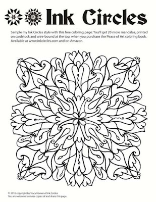
The Ink Circles coloring book "Peace of Art" has been out for a few months now and people everywhere are taking up coloring as a relaxing, enjoyable hobby.

I've created this new mandala frame (not a repeat from the book) as printable page for you to try. You'll be able to download it and print it. You're welcome to repost and share it, as long as you keep the text info on the page.

 Visit my site to download the high res version
Clicking the picture will take you to my website where you can
download a high or low resolution version.
 The book is available from inkcircles.com and on Amazon. It has 20 different mandalas in this general style, printed on cardstock and wire bound at the top.

Sunday, December 13, 2015

Pencil Tips: These are intense, Dude!

Continuing on with tips and reviews for various colored pencils, I present today Derwent's Inktense watercolor pencils. I was given a set of 24, and liked them so much, I ended up buying the big set of 72. (Keep reading for a chance to win that slightly-used 24 count set.)

Normally, I say look at the lead to see what color you're going to get. If that were the case for Inktense, we'd all have been sorely disappointed. The barrels are all blue, and the blip of paint at the non-pointy end isn't a great representation either. The purples, browns, blues - all the leads look a similar drab color, and given a few months start developing a waxy bloom (that doesn't affect their performance in any way) that further mystifies the actual color.

But who cares how they look in the tin. Look what happens when the water hits them! The rainbow comes to life. Except it's not a full rainbow. There are NO SUBTLE colors here. No gentle pinks, no tints of pale green, nothing remotely resembling any flesh colors (unless you are rendering Na'vi). Maybe if you really water them down, you could do it, but these are the wrong tool for that job.

Use them for what they were created - BOLD, BRIGHT, STRONG colors. It will take a bit of practice to learn what pencil makes each shade, but you can't ask for more vivid colors. They behave very well for watercolor pencils, but it will take a little stroking to completely melt the pencil lines on rougher paper. On smooth press or cardstock, the pencil lines are dissolved almost instantly, You can technically use them as regular colored pencils, but you won't see their true colors until they are wet.

Mandalas are a great use for high-intensity colors. This is Mandala #7 from the Peace of Art coloring book.
See the sidebar to order. This was done on the actual paper used in the book: a little ripple, but not bad at all.
Here is another mandala I painted with Inktense pencils:

An important thing to note about Inktense colors - they are permanent. Unlike other watercolors that you might be able to rewet and blot with a paper towel to lighten, no dice here, Once the section is dry, it isn't going anywhere. This can actually be useful! Paint a petal blue and find it needs to be bolder? Wait until dry, then go another round with the pencils, shading a darker blue at the petal base then use your wet brush to ease in the color. This is particularly effective in outlining an edge. Use a wet brush and dab on the pencil directly to get a blip of bright color to fill a tiny area. See those little stamen zingers in the picture above? That's how we do it.

If you are ready to get your own set, I offer two options. The first is a link to Amazon, where you can find all sorts of things. These pencils will also be at Dick Blick and other art places and possibly at a lower price. JoAnns and Michaels might carry the lower count sets. If you've got AdBlock, you won't see my lovely link, but presumably you know how to google.

The second option... as I mentioned, I upgraded after having the 24 count set for a while. I'm going to host a giveaway for my 24 count tin. They are LIKE NEW and will give someone many hours of pleasant coloring (until they become obsessed with more colors and need to upgrade - mwah hah ha). To enter in this drawing, leave a comment here, or on Facebook telling me what your favorite things to color/paint are, or what you currently use, or what you'd like to see in my next coloring book, etc. (An actual comment, not just "pick me.") I'll toss your name in a second time if you share the blog link. I'll pick a name on Boxing Day (Dec 26), as that is the fitting time to pass along things we no longer need.

Friday, December 4, 2015

Pencil Tips: Would that you go woodless

Since my coloring book came out, a lot of folks have asked for technique tips and my thoughts on various materials. So I'm kicking off series of blog posts called "Pencil Tips." I am far from all-knowledgeable and there are as many different ways to color and paint as there are artists. So, what I offer is to be read and used or dismissed as you see fit. Let me know if I've said something particularly helpful, or there are topics you'd be curious to hear my opinion on. I'll also disclose I'm using Amazon affiliate links, which give me a small kick-back if you click and buy. It won't change your price. Feel free to shop around, too, if you are inspired to buy things. Amazon is usually great to work with, but Dick Blick, Jerry's, Michaels, and your local art supply store may actually have better deals. If you have Ad-Block on, it won't show the links.

Today's topic is woodless watercolor pencils, specifically this set by Cretacolor called Aqua Monoliths. Woodless pencils are pretty cool - they are solid lead, in this case water-soluble, so you can paint with water over them to get watercolor effects. You can use them dry too, if you like. The casing is painted and lacquered, so you don't get your fingers all dirty while you use them. They come in a spiffy tin that will keep them from breaking and display them in an order that will make your shading and blending easier. As an engineer, I must point out the one logic flaw with the design, or at least the advertising. They brag about the percent more lead you get with a woodless design, but seriously how often do you let your pencil get dull enough that you are using the outer few millimeters? It might as well be cheaper wood out there since it will just get cut off with the sharpener. (Maybe if you're using them to color giant background areas?) They are still a good deal.

The original painting for Mandala #17 in Peace of Art, painted in Cretacolors

Cretacolors makes 72 shades in this line. I always get the biggest pencil set if I can, unless the line is "open stock" which means you can pick them up one at a time. Your color printer can make beautiful pictures with only four colors of ink or toner, but it's easier when coloring by hand to get predictable colors and shading using a fuller palette. The bigger set means more colors to choose from, which is important because the first thing I do is set aside about two thirds of the colors to keep the palette tight. This painting was done with the muted colors in the set - maybe 25 shades.

These pencils are nice to work with. The shades are all distinct with no obvious gaps in the rainbow. The lead is HARD but goes onto the paper smoothly.  I've painted about 10 mandalas with this set and I don't think I've had to sharpen a single one, Nor have any of them broken, or had so much as a tip chip off. Meaning this set will last a loooooong time before I have to worry about replacing a favorite color. There are a few places where the painted color of the pencil outside doesn't really match the color of the lead, and an occasional color where adding water seemed to unexpectedly brighten or dull the color rather than just spread it around. That is why you might want to have a little test area to play in. They blend really well, as you can see.


Important test for watercolor pencils, and these pass, is whether the lead dissolves easily with the water. You want the lead to feel like it melts away without having to scrub at it to remove pencil marks. This lets you blend colors together in areas to create a gradient. You can see the effect above. This particular watercolor paper I used has a really pronounced grain which causes pigment particles, whether from pencils or tube watercolors, to settle into the valleys and give a faint stripey look.

The cardstock I've used to print the Peace of Art books can be watercolor painted if you're careful to not use too much water. You'll want to take the sheet out so you don't dampen the one underneath. You will get a little rippling, If this bothers you, then use spray adhesive to mount it on a mat board before you start or just use dry media. Some folks also use a coat or three of clear Gesso, drying after each, to create a thicker and water-colorable paper.

A nice tin of pencils is a great gift idea for an artist in your life. And who is to say you don't deserve a gift as well?

Have fun coloring,
Tracy

Tuesday, October 27, 2015

Branching Out: Peace of Art

My biggest announcement of the year! I love coloring mandalas, and now YOU can color my mandalas too. I've been working on a coloring book, and now it is ready. It's got 20 different mandalas ready for you sit back, relax, and color.

Ink Circles is publishing a coloring book. This is what the cover looks like.
It's called Peace of Art, a little pun because you will be creating a piece of art and you will be enjoying the peace of this relaxing art form.  If you've been watching at all, you'll have noticed a stream of interviews/programs/studies in the social media that tout the benefits of coloring as an adult hobby.

In what may be either a brilliant or a foolish move, I have chosen to distribute through Amazon as my primary fulfilment vehicle. You'll get Prime 2-day shipping; you'll get their price breaks (if they discount it); you'll be able to write and read reviews; I'll get a huge potential audience.


If you're not seeing the link directly above because of Adblock or your firewall, you'll need to go to Amazon and search the old fashioned way. It says order, but technically it is "pre-order" until Nov 10th.

Some of the choices I made in putting this together that might set my book apart from others:

  • Single-sided (8.5 x 11"), so you can cut out pages and frame (or hang on your fridge) without losing a second page.
  • Cardstock pages, so you can use colored pencils OR marker, or maybe even watercolor pencils without the page bleeding through or rippling.
  • Spiral wire binding, it folds back flat to whatever page you choose. No coloring in the binding area.
  • Spiral at the top: both my kids are southpaws. That side spiral gets in the way, so this works great for right or left handed colorists.
  • A color test area on each page so you can check if your shading works or that pink is as bright as you hoped. It's designed such that it can be cut out to make a bookmark afterwards.
One of the 20 pages. You can see the binding and the bookmark in this photo.

Pick the colors that make you smile. Relax, there is no wrong way to do it.

Complete with a real ISBN: 978-0-9969675-0-1
I feel so official!
I'll be adding this to the Ink Circles site for ordering, as well as my Etsy shop, in the interest of complete marketing options, but don't feel bad getting it from your cheapest easiest source. (Only feel bad if you are getting it illegally from a scanned pirated posted copy.)

Namaste!