Saturday, April 23, 2016

Give it a try

The Ink Circles coloring book "Peace of Art" has been out for a few months now and people everywhere are taking up coloring as a relaxing, enjoyable hobby.

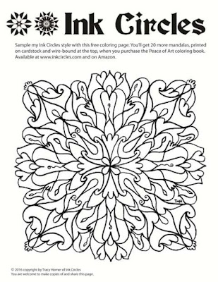
I've created this new mandala frame (not a repeat from the book) as printable page for you to try. You'll be able to download it and print it. You're welcome to repost and share it, as long as you keep the text info on the page.

 Visit my site to download the high res version
Clicking the picture will take you to my website where you can
download a high or low resolution version.
 The book is available from inkcircles.com and on Amazon. It has 20 different mandalas in this general style, printed on cardstock and wire bound at the top.

Sunday, December 13, 2015

Pencil Tips: These are intense, Dude!

Continuing on with tips and reviews for various colored pencils, I present today Derwent's Inktense watercolor pencils. I was given a set of 24, and liked them so much, I ended up buying the big set of 72. (Keep reading for a chance to win that slightly-used 24 count set.)

Normally, I say look at the lead to see what color you're going to get. If that were the case for Inktense, we'd all have been sorely disappointed. The barrels are all blue, and the blip of paint at the non-pointy end isn't a great representation either. The purples, browns, blues - all the leads look a similar drab color, and given a few months start developing a waxy bloom (that doesn't affect their performance in any way) that further mystifies the actual color.

But who cares how they look in the tin. Look what happens when the water hits them! The rainbow comes to life. Except it's not a full rainbow. There are NO SUBTLE colors here. No gentle pinks, no tints of pale green, nothing remotely resembling any flesh colors (unless you are rendering Na'vi). Maybe if you really water them down, you could do it, but these are the wrong tool for that job.

Use them for what they were created - BOLD, BRIGHT, STRONG colors. It will take a bit of practice to learn what pencil makes each shade, but you can't ask for more vivid colors. They behave very well for watercolor pencils, but it will take a little stroking to completely melt the pencil lines on rougher paper. On smooth press or cardstock, the pencil lines are dissolved almost instantly, You can technically use them as regular colored pencils, but you won't see their true colors until they are wet.

Mandalas are a great use for high-intensity colors. This is Mandala #7 from the Peace of Art coloring book.
See the sidebar to order. This was done on the actual paper used in the book: a little ripple, but not bad at all.
Here is another mandala I painted with Inktense pencils:

An important thing to note about Inktense colors - they are permanent. Unlike other watercolors that you might be able to rewet and blot with a paper towel to lighten, no dice here, Once the section is dry, it isn't going anywhere. This can actually be useful! Paint a petal blue and find it needs to be bolder? Wait until dry, then go another round with the pencils, shading a darker blue at the petal base then use your wet brush to ease in the color. This is particularly effective in outlining an edge. Use a wet brush and dab on the pencil directly to get a blip of bright color to fill a tiny area. See those little stamen zingers in the picture above? That's how we do it.

If you are ready to get your own set, I offer two options. The first is a link to Amazon, where you can find all sorts of things. These pencils will also be at Dick Blick and other art places and possibly at a lower price. JoAnns and Michaels might carry the lower count sets. If you've got AdBlock, you won't see my lovely link, but presumably you know how to google.

The second option... as I mentioned, I upgraded after having the 24 count set for a while. I'm going to host a giveaway for my 24 count tin. They are LIKE NEW and will give someone many hours of pleasant coloring (until they become obsessed with more colors and need to upgrade - mwah hah ha). To enter in this drawing, leave a comment here, or on Facebook telling me what your favorite things to color/paint are, or what you currently use, or what you'd like to see in my next coloring book, etc. (An actual comment, not just "pick me.") I'll toss your name in a second time if you share the blog link. I'll pick a name on Boxing Day (Dec 26), as that is the fitting time to pass along things we no longer need.
Friday, December 4, 2015

Pencil Tips: Would that you go woodless

Since my coloring book came out, a lot of folks have asked for technique tips and my thoughts on various materials. So I'm kicking off series of blog posts called "Pencil Tips." I am far from all-knowledgeable and there are as many different ways to color and paint as there are artists. So, what I offer is to be read and used or dismissed as you see fit. Let me know if I've said something particularly helpful, or there are topics you'd be curious to hear my opinion on. I'll also disclose I'm using Amazon affiliate links, which give me a small kick-back if you click and buy. It won't change your price. Feel free to shop around, too, if you are inspired to buy things. Amazon is usually great to work with, but Dick Blick, Jerry's, Michaels, and your local art supply store may actually have better deals. If you have Ad-Block on, it won't show the links.

Today's topic is woodless watercolor pencils, specifically this set by Cretacolor called Aqua Monoliths. Woodless pencils are pretty cool - they are solid lead, in this case water-soluble, so you can paint with water over them to get watercolor effects. You can use them dry too, if you like. The casing is painted and lacquered, so you don't get your fingers all dirty while you use them. They come in a spiffy tin that will keep them from breaking and display them in an order that will make your shading and blending easier. As an engineer, I must point out the one logic flaw with the design, or at least the advertising. They brag about the percent more lead you get with a woodless design, but seriously how often do you let your pencil get dull enough that you are using the outer few millimeters? It might as well be cheaper wood out there since it will just get cut off with the sharpener. (Maybe if you're using them to color giant background areas?) They are still a good deal.

The original painting for Mandala #17 in Peace of Art, painted in Cretacolors

Cretacolors makes 72 shades in this line. I always get the biggest pencil set if I can, unless the line is "open stock" which means you can pick them up one at a time. Your color printer can make beautiful pictures with only four colors of ink or toner, but it's easier when coloring by hand to get predictable colors and shading using a fuller palette. The bigger set means more colors to choose from, which is important because the first thing I do is set aside about two thirds of the colors to keep the palette tight. This painting was done with the muted colors in the set - maybe 25 shades.

These pencils are nice to work with. The shades are all distinct with no obvious gaps in the rainbow. The lead is HARD but goes onto the paper smoothly.  I've painted about 10 mandalas with this set and I don't think I've had to sharpen a single one, Nor have any of them broken, or had so much as a tip chip off. Meaning this set will last a loooooong time before I have to worry about replacing a favorite color. There are a few places where the painted color of the pencil outside doesn't really match the color of the lead, and an occasional color where adding water seemed to unexpectedly brighten or dull the color rather than just spread it around. That is why you might want to have a little test area to play in. They blend really well, as you can see.


Important test for watercolor pencils, and these pass, is whether the lead dissolves easily with the water. You want the lead to feel like it melts away without having to scrub at it to remove pencil marks. This lets you blend colors together in areas to create a gradient. You can see the effect above. This particular watercolor paper I used has a really pronounced grain which causes pigment particles, whether from pencils or tube watercolors, to settle into the valleys and give a faint stripey look.

The cardstock I've used to print the Peace of Art books can be watercolor painted if you're careful to not use too much water. You'll want to take the sheet out so you don't dampen the one underneath. You will get a little rippling, If this bothers you, then use spray adhesive to mount it on a mat board before you start or just use dry media. Some folks also use a coat or three of clear Gesso, drying after each, to create a thicker and water-colorable paper.

A nice tin of pencils is a great gift idea for an artist in your life. And who is to say you don't deserve a gift as well?

Have fun coloring,
Tracy

Tuesday, October 27, 2015

Branching Out: Peace of Art

My biggest announcement of the year! I love coloring mandalas, and now YOU can color my mandalas too. I've been working on a coloring book, and now it is ready. It's got 20 different mandalas ready for you sit back, relax, and color.

Ink Circles is publishing a coloring book. This is what the cover looks like.
It's called Peace of Art, a little pun because you will be creating a piece of art and you will be enjoying the peace of this relaxing art form.  If you've been watching at all, you'll have noticed a stream of interviews/programs/studies in the social media that tout the benefits of coloring as an adult hobby.

In what may be either a brilliant or a foolish move, I have chosen to distribute through Amazon as my primary fulfilment vehicle. You'll get Prime 2-day shipping; you'll get their price breaks (if they discount it); you'll be able to write and read reviews; I'll get a huge potential audience.


If you're not seeing the link directly above because of Adblock or your firewall, you'll need to go to Amazon and search the old fashioned way. It says order, but technically it is "pre-order" until Nov 10th.

Some of the choices I made in putting this together that might set my book apart from others:

  • Single-sided (8.5 x 11"), so you can cut out pages and frame (or hang on your fridge) without losing a second page.
  • Cardstock pages, so you can use colored pencils OR marker, or maybe even watercolor pencils without the page bleeding through or rippling.
  • Spiral wire binding, it folds back flat to whatever page you choose. No coloring in the binding area.
  • Spiral at the top: both my kids are southpaws. That side spiral gets in the way, so this works great for right or left handed colorists.
  • A color test area on each page so you can check if your shading works or that pink is as bright as you hoped. It's designed such that it can be cut out to make a bookmark afterwards.
One of the 20 pages. You can see the binding and the bookmark in this photo.

Pick the colors that make you smile. Relax, there is no wrong way to do it.

Complete with a real ISBN: 978-0-9969675-0-1
I feel so official!
I'll be adding this to the Ink Circles site for ordering, as well as my Etsy shop, in the interest of complete marketing options, but don't feel bad getting it from your cheapest easiest source. (Only feel bad if you are getting it illegally from a scanned pirated posted copy.)

Namaste!


Friday, May 29, 2015

Mandalas

Some new paintings.


Tuesday, December 9, 2014

New mandalas
It's been a while since I posted paintings, so here are two new ones and a few shots from my work area.
Finish #2

And I learned my camera had a setting to take a negative picture.


Drawing inks

Fountain pen inks
Finish #1


Something bad happened here, and this
bottle turned to gel.

An in-progress shot of that first one.

Getting a little closer. These normally take about three
watercolor sessions after the ink has dried.

Tuesday, June 17, 2014

Lace works

I've been working on a new concept, inspired some diagrams of needlelace found in antique books. It appeared that various elements are used to fill a square, and the squares are arranged in pretty patterns. You know how much I love squares, patterns, and symmetry,

The diagrams look along the lines of this:

My first drawing was done in pen and ink, making a mandala of sorts. I used some blocks from the diagrams and invented some of my own.

The next experimental step was to add some color and a few more elements that deviated from a strict grid. I started by painting a grid of squares and triangles in different colors, then I drew some design lines on top. The background square were done in Turner Acryl Gouache, so they have a matte finish, but unlike regular gouache, I can paint more on top of them without rewetting and disturbing the base layer.

I used darker iridescent colors to fill in some of the design areas. 
And more:
The last step (and the scariest, since there is no going back once started) was to paint on fine black lines everywhere. I think it came out pretty cool looking, although it is tough to capture the colors and the pearlescence in a photo. I have no idea how to finish it. It's on 12 x 16" canvas, and the design goes all the way out to the edge, so I think I'll have to mount it onto a box frame... so I can hang it on the wall space I don't have. :-P
Let the experiments continue!

Tuesday, January 7, 2014

Fit for a King

Every parent at some time has gotten the 7pm comment, "Oh yeah, Mom - I need to bring a X for my Y class tomorrow," where X represents some random baked good and Y represents some school subject where caloric extra credit is encouraged or a holiday party is scheduled. My challenge: King Cake to accompany my son's presentation in his Spanish class.

As I perused recipes online, I inquired of him why they were celebrating Mardi Gras in January (it's March 4th this year.)  It was convenient he had prepared the presentation already that explained Spanish speaking countries celebrated Día de los reyes magos by eating rosca de reyes on January 6th. I had no idea but am always looking for a good excuse to eat cake! This is actually more of a bread, traditionally in an oval shape and decorated with raisins and other dried fruit.
rosca de reyes

The recipes turned out to be similar enough to my familiar yeasted braided Christmas bread (Tassajara Bread Book) that my Mum had taught me to make when I was hardly big enough to knead dough. She and I both still make it most Christmases. I just made it one layer tall, oval, and added a glaze. His class gets the colorful one in the back.  It's a day late, but I don't think it will dampen their little sugar-craving appetites.

Due to envisioned liability scenarios, we opted to leave out the little baby-shaped trinket that is traditionally baked in the cake. Also for want of owning an appropriate bakeable plastic baby.  I do now, however, have the strong urge to dig up a copy and reread Tolkien's Smith of Wootton Major. If you've read it, you know why.

So I learned a bit of history and tradition, I learned that starting at 7pm is way too late to begin baking yeasted breads, and I learned that blue sugar crystals + pink sugar crystals do not remotely look like purple sugar crystals. But I'll be ready with purple for next January 6th.


Sunday, December 22, 2013

Tiny Sweater

Last fall my FIL sent me his entire cotton crop. He had one plant.  He joked whether it was enough to knit him a sweater.


So, for Christmas, I have spun and knit this for him. You probably can't see the tiny saddle shoulders, but I used the EPS (Elizabeth's Percentage System - knitters will have heard of that, maybe.)

Back to your regularly scheduled programming. And back to my regularly scheduled, regularly sized knitting. This tiny stuff is pretty fussy, but it came out darn cute.

Friday, November 1, 2013

Happy Fountain Pen Day

My posts seem to alternate between ink and wool. It seems I can't make up my mind which medium to focus on during my fluffing off times. Fortunately, I've not been forced to specialize.  Today being officially "Fountain Pen Day," makes it the easy choice of topic.

Got ink?
Here are some interesting factoids about fountain pens from the Pen Heaven blog. I don't have anything that comes close to the million dollar pen they mention - most of mine are in that cheap yet functional category. The exception being the unassuming green Sheaffer (5th from left) which someone told me was actually worth about $200! It would be terribly easy to pick out and order new pens every month, but I've limited my indulgences to joining a monthly ink club at Goulet Pens. I'm sorely tempted each week by their newsletters with all the sexy pen photos, and the Jet Pens emails too. November's samples are due to arrive any day and I haven't even used up a single one of October's five Ink Drop samples. (They're good for multiple pen fillings.) I guess that means I'd better get writing with a pen rather than a keyboard.

And for those of you who are stitching, rather than writing today, I point you over to my complimentary pen nib cross stitch design. Just remember to keep the ink away from the linen!!!
Click to get the full size pdf.
Cheers,
Tracy